Creating a Graph
Use graphs to visually analyze financial trends in a corporation. Accounts linked directly from the accounting database in Working Papers or Time easily transform into a graphical presentation. Cell values represent data points, which display as dots, lines, bars, shaded areas. Select the cells containing the data you want to plot by pressing the ALT key and dragging the pointer. A data series refers to a group of data points.
Each data series in a chart has a unique color for ease of identification. Labels can be assigned to each data series to appear along the X-axis. Charts can be shown with or without grid lines. Depending on the type of chart, it may be necessary to omit data points from each series. You can specify the data points to plot.
Any negative data points display as zero in the graph if using a stacked chart type. To present negative values in a chart, select one of the following chart types: line, bar, points, or area. Click the Preview tab to view the chart as it appears in your document.
- On the Insert menu, select Graph.
- Select the Chart option and click OK.
- Click General. In quotes, enter a Title for the graph and titles for the X and Y-axis, as well as any sub-title for the graph, if desired. Use the pull-down menus and check boxes to select fonts and formatting for the titles.
- Click Data.
-
In your CaseView document, hold down the ALT key and drag the mouse to select the first series of cells for your graph. Click in the Graph Properties dialog. These cells are now highlighted in the "Cells Available" list.
Click in the first cell under the data series column you wish to add these cells to, and click the arrow key to move the cells listed in the cells available list into the data series.
- Repeat step 5 for all the data groups of cells you wish to add to the graph, creating a new column in the data series pane for each set of cells.
- Fill in labels for the information being graphed (the data series) and the vertical gridlines (labels) in the graph.
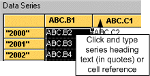
Double-click the first column’s heading and either type (in double quotes) a new name for that column of data in the series (such as "Net income" or "Sales") or type an existing cell number that contains text to be used as the series title.
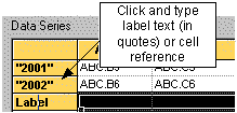
For each of the lines in the data series, click Label and either type (in double quotes) a new name for that row of data in the series (such as the year) or type an existing cell number.
- Click Chart Options.
- Under Plotting method, select the type of graph you want. If desired, select a Graph Width and Height. Click the Preview tab to see what the selected graph type will look like with the data included.
- Select any other options for the graph such as gridlines and colors. Click the Preview tab to view the graph as it will appear in the document.
- Click the Colors tab to make any adjustments to colors to be used in the graph.
- When finished, click OK.
Notes
- Graphs have a minimum height of 1".
![]()
Visit us: www.caseware.com | Follow us: 


© 2019 CaseWare International Inc. | Privacy | Terms of Use | Trademarks