Create charts and graphs
You can create charts and graphs to visually analyze financial trends of the accounts in the Working Papers database. Cell values represent data points, which display as dots, lines, bars, or shaded areas in the chart or graph. Each data series in a chart or graph uses a unique color for ease of identification, but you can also assign labels to each data series as required.
There are several variations of charts and graphs available for creation:
- Area (Stacked, Stacked Percent)
- Bar (Stacked, Stacked Percent)
- Horizontal Bar (Stacked, Stacked Percent)
- Line
- Points (+BestFitCurve, +BestFitLine, +Line, +Spline)
- Ribbon
- Spline
- Pie
Notes:
- Negative data points display as zero if you are using a stacked or pie chart type. To present negative values in a chart, create either a line, bar, point, or area chart.
- Charts and graphs have a minimum height of 1".
To create a chart:
- On the ribbon, click Insert | Graph.
- In the Graph Type dialog, select Chart. Click OK.
- In the Graph Properties dialog, click the Labels tab. Inside the quotes, enter a main title, an optional sub-title, and titles for both the X and Y Axes. If you want to customize the font style and size of these titles, you can do so on the Fonts tab.
- Click the Data tab. A list of cells in the document is displayed.
- In the Data Series group, click an empty cell. In the Cells Available group, select the cell that you want to assign and click =>. Repeat this process for all the data groups of cells that you want to add to the chart.
-
Customize the labels for both the series' (columns) and points (rows) by clicking the cell and typing the new label. You can enter cell numbers inside quotations to populate the label with the cell's text.
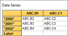
- Click the Format 1/2 tab. In the Plotting Method drop-down menu, select the type of chart that you want to display.
- Customize any additional graph properties as desired. Click OK.
The chart is created in the CaseView document.
To create a pie chart:
- On the ribbon, click Insert | Graph.
- In the Graph Type dialog, select Pie. Click OK.
- In the Graph Properties dialog, click the Labels tab. Inside the quotes, enter a main title and an optional sub-title for the pie chart. If you want to customize the font style and size of these titles, you can do so on the Fonts tab.
- Click the Data tab. A list of cells in the document is displayed.
- In the Data Series group, click an empty cell. In the Cells Available group, select the cell that you want to assign and click =>. Repeat this process for all the data groups of cells that you want to add to the chart.
-
Customize the labels for both the series' (columns) and points (rows) by clicking the cell and typing the new label. You can enter cell numbers inside quotations to populate the label with the cell's text.
- Under Pie Options, click the Data tab. In the Data Series drop-down menu, select the data series to use for the pie chart.
- Customize any additional graph properties as desired. Click OK.
The pie chart is created in the CaseView document.
After creating a chart or graph, you can modify it by simply right-clicking the chart or graph, then selecting Edit Chart/Pie Graph.... You can also convert a chart into a pie chart, or a pie chart into a chart by clicking Convert Chart....
Export a chart or graph
You can export a chart or graph to an image file directly from CaseView.
To export a chart or graph to an image file:
- Right-click the chart or graph in the CaseView document, then click Export to PNG....
- In the Graph Export dialog, next to the File name field, click ....
- Navigate to the location where you want to save the image file. Enter a file name for the image, then click Save.
- If required, modify the image dimensions. The maximum dimensions supported are 1500x1500. Click OK.
The chart or graph is exported to an image file.
![]()
Visit us: www.caseware.com | Follow us: 


© 2022 Caseware International Inc. | Privacy | Terms of Use | Trademarks