Creating a Chart Graph
Use graphs to visually analyze financial trends in a corporation. Accounts linked directly from the accounting database in Working Papers or Time easily transform into a graphical presentation. Cell values represent data points, which display as dots, lines, bars, shaded areas. A data series refers to a group of data points (e.g. Revenues).
Each data series in a chart has a unique color for ease of identification. Labels can be assigned to each data series to appear along the X-axis (e.g. Years). Charts can be shown with or without grid lines. Depending on the type of chart, it may be necessary to omit data points from each series. You can specify the data points to plot.
Any negative data points display as zero in the graph if using a stacked chart type. To present negative values in a chart, select one of the following chart types: line, bar, points, or area. Click the Preview tab to view the chart as it appears in your document.
- On the Insert tab, click Graph.
- Select the Chart option and click OK.
- Click the Labels tab. In quotes, enter a Title for the graph and titles for the X and Y-axis, as well as any sub-title for the graph, if desired.
- Click the Fonts tab. Select fonts and formatting for the titles.
- Click the Data tab.
-
In the Cells Available list, select a cell for your graph. Click the applicable square in the Data Series table you want to add the cell to, and then click the right arrow key to link the cell. Alternatively, you can drag and drop a cell to a square in the Data Series table.
Select multiple cells, using Shift + click or Ctrl+ click, to populate the same vertical number of squares in the Data Series table.
- Repeat step 6 for all the data groups of cells you wish to add to the graph, creating a new column in the data series pane for each set of cells.
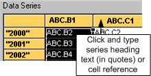
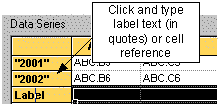
- Fill in the data series names and X-axis labels for the information being graphed.
For each column heading, click Series and either type (in double quotes) a new name for that column of data in the series (such as "Net income" or "Revenues") or type an existing cell number that contains text to be used as the series title.
For each of the X-axis category rows, click Label and either type (in double quotes) a new name for that X-axis row (such as the year) or type an existing cell number.
- In the Plotting Method list, select the type of graph you want. If applicable, select a Graph Width and Height.
- Click the Chart Options - Format (2/2) tab. Select any required options.
- Click the Colors tabs to make any adjustments to colors to be used in the graph.
- When finished, click OK.
Notes
- Graphs have a minimum height of 1".


Legal
Related Help